Overview
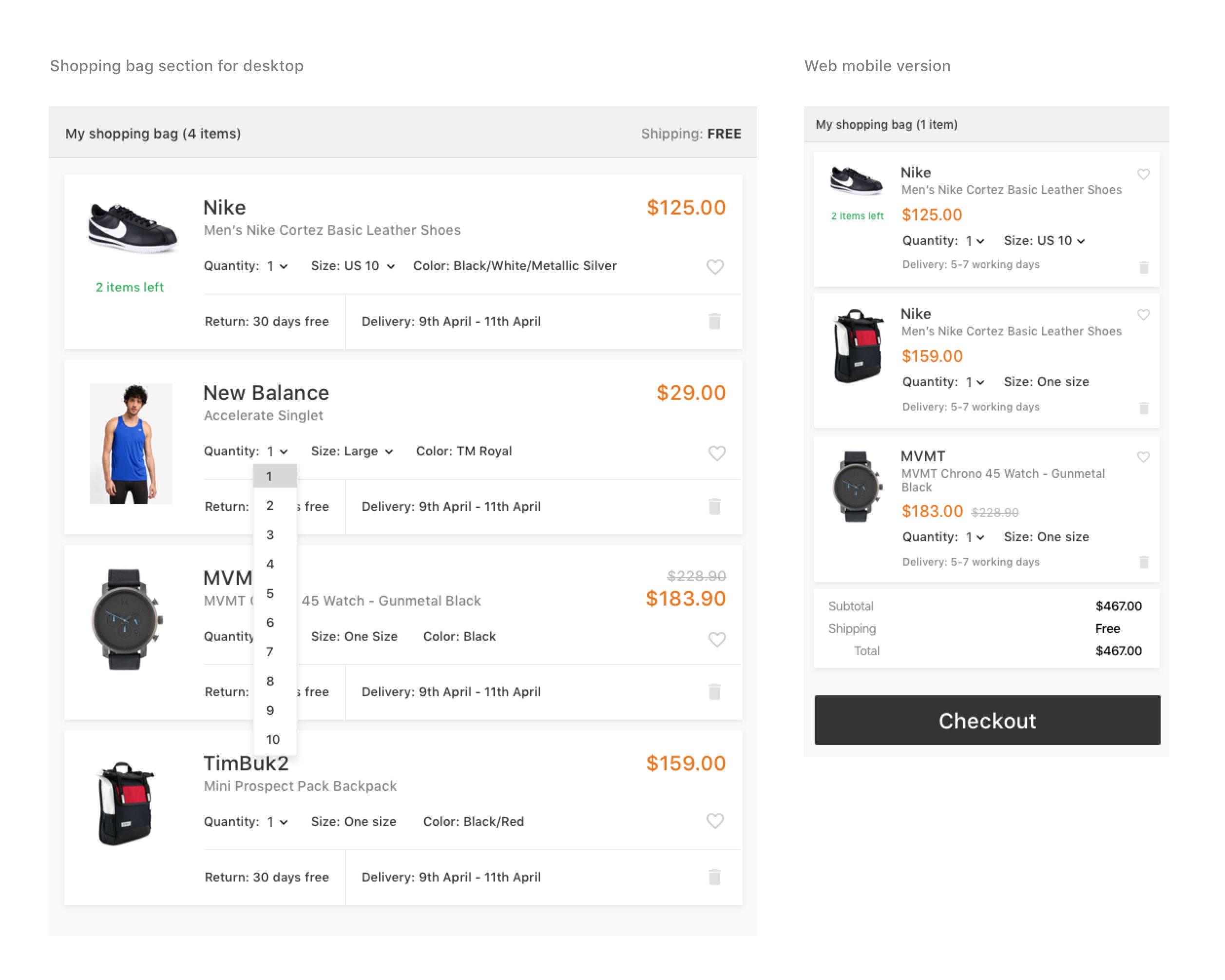
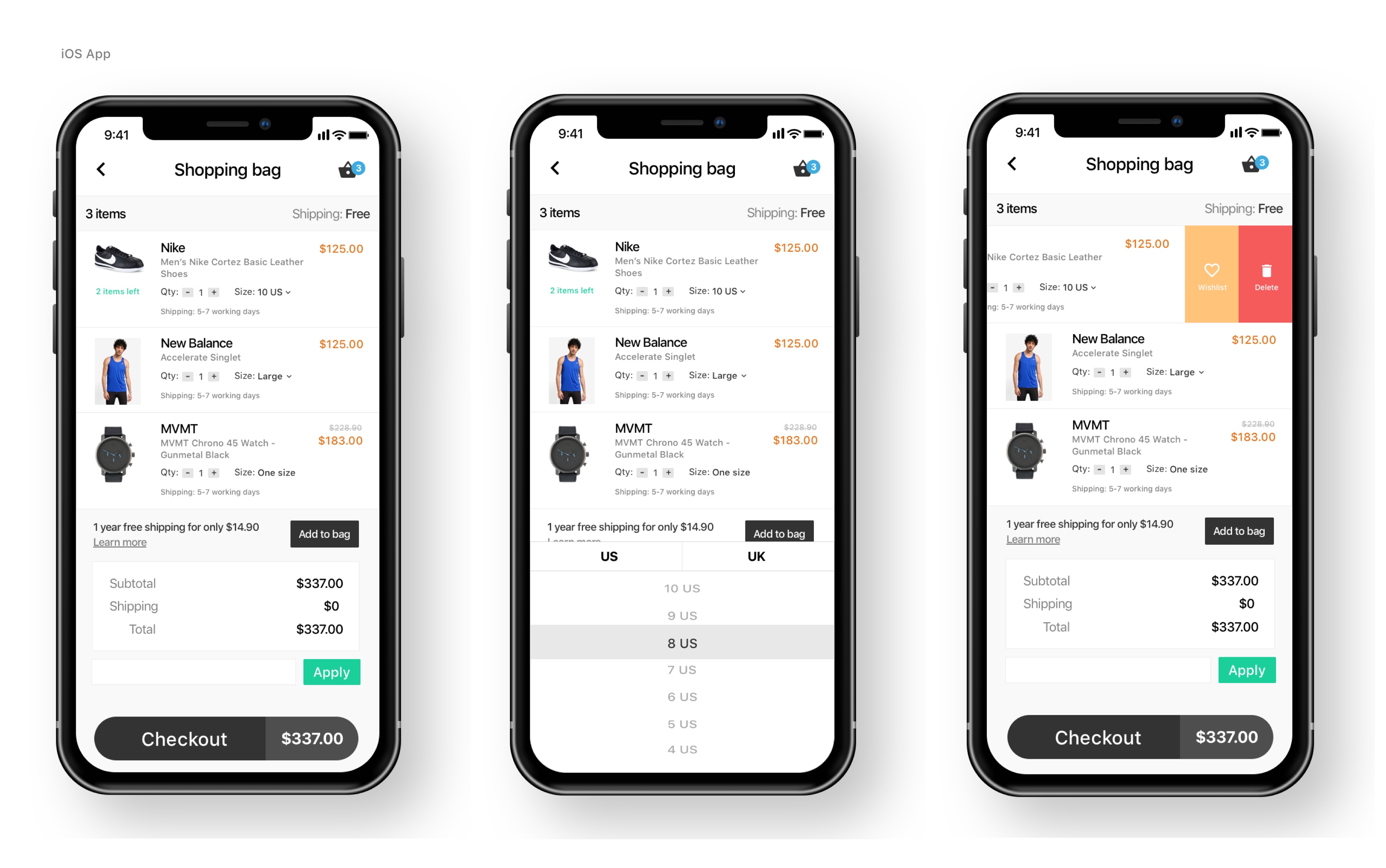
This case study is for Zalora's recruitment exercise. I was tasked by Zalora's recruiting team to re-design their shopping cart for mobile. This is part of their recruitment process.. I've done a simple UI following their brand which is black&white and played around the fonts and whitespacing.
The recruitment team sent me screenshots of Zalora's current design.

Looking at the screenshots above, I've noticed that the layout and experience is not that bad. Users can still accomplish the task and be delighted.
But this is what I came up with.


Disclaimer: I don't work for Zalora. This is only my case study as part of Zalora's recruitment process.